5 Proven Techniques To Reduce Bounce Rates
The most common question website owners ask is, ‘Why do visitors never make it to conversion?’, but the question they should be asking is, ‘Why is my site facing a high bounce rate?’
The reason you are struggling with low conversion rates is that the majority of visitors leave your website before completing any tasks or making purchases.
Do you know what that means?
It means your website is a victim of a high bounce rate.
A high bounce rate is the #1 conversion killer. If most visitors are leaving your website after only looking at the first page, you will never have a chance to turn them into customers or subscribers.
Let’s take a look at what a bounce rate is before discussing how to decrease it.
What is Bounce Rate?
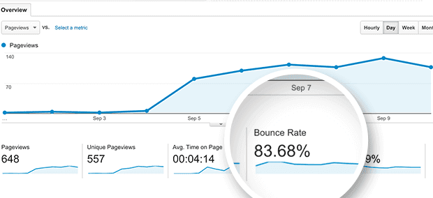
Bounce rate is the percentage of visitors who come to your website and leave without navigating to a second page.
A high bounce rate is a sign that your website does not encourage users to stay for long enough to get buy-in or complete a call-to-action (e.g. subscribe to a mailing list or buy your products or services).
Users can bounce back from your site to a different link suggested by search engines by clicking the back button, closing the open tab, or entering a new URL in the search bar. It may also be due to a session timeout caused by hosting errors.
You may be thinking, ‘So what? That’s natural user behavior.’
No, it’s not.
A high bounce rate means users don’t have any reason to wander around your site.
So, do you have a good bounce rate or a bad bounce rate?
Let’s take a look at the various rates and what they depict:
- 80% and over = bad bounce rate
- 70–80% = poor bounce rate
- 50–70% = average bounce rate
- 30–50% = excellent bounce rate
If you have 20% or lower, it may be caused by a tracking error due to a duplicate analytics code, inaccurate input of event tracking or third-party addons like a post-carousel widget.
If you have a bad bounce rate, it could be due to a slow webpage loading time, leading to confusing navigation, poor user experience, weak design, a lack of call-to-action transparency, and more.
By now, you know the importance of your bounce rate. Without further ado, let’s dive into how to improve your bounce rate and increase your site’s conversion rate.
5 Proven Ways to Reduce Bounce Rate
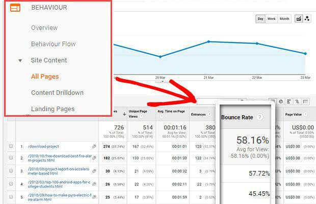
Before you learn the 5 proven tactics that reduce bounce rate, it’s a good idea to take note of some pages with a higher bounce rate. To do so:
- Open Google Analytics
- Click on Behaviour -> Site Content -> Landing Pages
You will find metrics that look like the image below along with the bounce rate:
The list of pages with a high bounce rate will help you detect the problem and fix it using the solutions below.
1. Increase the Loading Speed
Users are impatient. They don’t like slow sites. As per Radware’s Web Performance statistics, a connection speed delay of 500 milliseconds may result in a 26% increase in frustration and an 8% decrease in engagement.
This data matters because we are living in the mobile generation where users won’t wait for a site that takes 15 seconds to load.

Get weekly insights for revenue-shifting results
Sign up for our newsletter and be the first one to know about our exclusive offers, digital marketing news and updates.
|
|
Thank you for Signing Up |


According to data from Think With Google, 53% of mobile visitors leave pages that take longer than 3 seconds to load. Since more than half of overall online traffic comes from mobile users, websites that make users wait more than 3 seconds are prone to losing massive revenue opportunities.
In conclusion, speed = revenue.
To boost the speed of your site, you must do the following:
- Decrease the loading time of visuals without affecting their quality
- Use a content delivery network to improve website performance
- Get the fastest hosting service provider
- Take guidance from an expert SEO company to ensure a quick mobile and desktop site
2. Reconsider the Time and Place of CTAs
Remember, your first impression is your last impression. Most users decide whether they like a site or not within the first few seconds. Therefore, you have to create an interesting homepage to immediately capture their attention. To do this, you must identify the location of your homepage where users’ eyes travel first. Generally, it’s on the right side of the top of your homepage (depending on the device size) where no scrolling is required.
For example, Amazon always puts the best offers at the top of the webpage, mobile site, and even their app.
Once you know where users are looking first, you will have to optimise that particular area. It must portray your products or services as being in the users’ best interests with a clearly visible call-to-action.
3. Serve the Content Buffet
Words alone are not going to win the game. They bore users, and today’s millennials are more drawn in by visuals like images and videos. They need a variety of content to stay interested.
Just like a restaurant serves a buffet of various types of food, you must decorate your pages with different types of content. Let the users choose their preferred mode of content while you focus on adding value.
Want some inspiration?
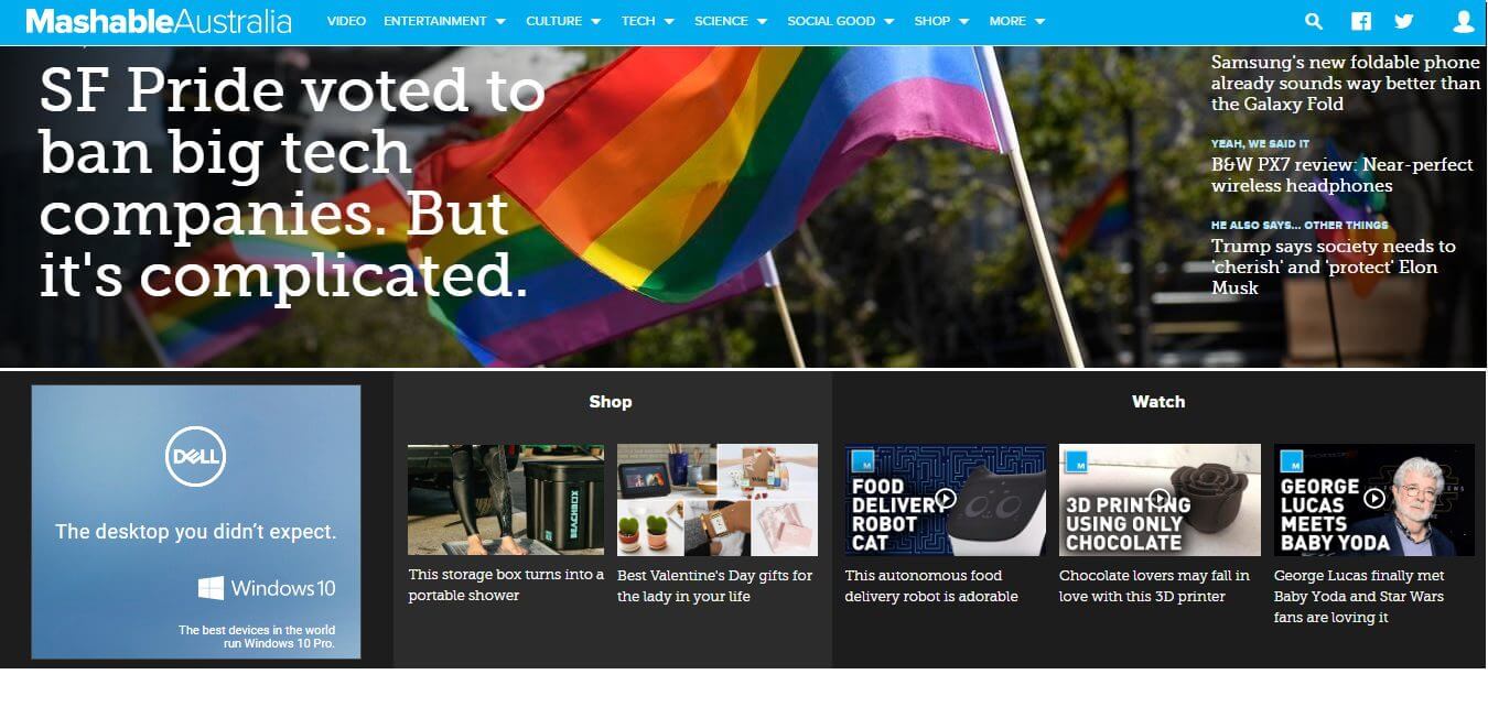
Note the variety of content ranging from images and videos to what’s going on in the tech world.
Remember that your content doesn’t necessarily need to be just about your company. You can spread news relevant to your niche as well, which will become one more reason for users to stay longer.
4. Insert High-Quality and Engaging Visuals
Not just any visuals will work. They must be high-quality and clear enough to convey the right message to users. This is where you have to consider your mobile and desktop users simultaneously and keep your website loading speed in mind.
Animations, background images, audio clips, video presentations, music, selective colours based on psychology, and much more will persuade users to learn more about your business. All you need to know is how to use them correctly to avoid overwhelming users with too much content or negatively impacting the loading speed of your website.
5. Include Trustworthy Elements
Scams are everywhere on the internet, and users have become extra cautious these days. They don’t trust just any website.
Let’s take a look at how users judge your website’s reliability.
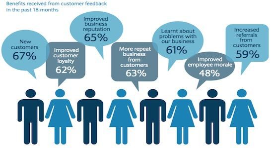
First, they examine your website’s offers. Once they are satisfied with the offers, they look for other sources to increase their trust, such as those who have used your product in the past and are satisfied with the result. This is where reviews, certifications, industry affiliations, and quality scores play a pivotal role.
A new user cannot trust your business based only on the information you give them. They also judge it based on your online reputation.
Your website is the best place to showcase your reputation. Put some reviews and other achievements on display to elevate users’ trust and decrease your bounce rate. Showing users other trust factors, such as the security of your website, is another advantage for users that helps them feel safe when sharing their personal information.
Tip: If you have Google reviews, you can put them on your website too.
In Summary
Now you have the 5 proven ways to reduce your bounce rate and, as a result, increase your conversion rate. But, without the support of high-quality design and content with minimal load time, you won’t be able to cut your bounce rate in half. An SEO and content strategy will help you design a user-friendly website. If you can achieve that, you can gradually increase the time users spend on your website.
In search for strategic sessions?
Let us understand your business thoroughly and help you
strategies your digital product.
It's time to call your business-
a brand!
Australian Owned Agency
Save Time and Money
Unbeatable Value
Where Work Gets Done
free Ecommerce SEO guide for Higher Sales & Conversion


THE ULTIMATE MARKETING GUIDE FOR LAWYERS


Youtube Ads Guide How to Advertise on Youtube


free Ecommerce SEO guide for Higher Sales & Conversion


It's time to call your business-
a brand!
Australian Owned Agency
Save Time and Money
Unbeatable Value
Where Work Gets Done


The Game-Changing Ecommerce SEO Guide That Will Blow Your Mind & Sales
With this Ecommerce SEO Guide, you'll be able to:
- Develop a Ecommerce SEO strategy.
- Build a content marketing strategy that aligns with your business goals.
- Convert your website visitors into paying customers.


Youtube ads guide how to advertise on youtube
With this Youtube ads Guide, you'll be able to:
- Develop a Youtube ads strategy.
- Build a type of ads of your own that aligns with your business goals.
- Generate revenue from youtube ads.
It's time to call your business-
a brand!
Australian Owned Agency
Save Time and Money
Unbeatable Value
Where Work Gets Done



 Australian Owned Agency
 Save Time and Money
 Unbeatable Value
 Where Work Gets Done