7 Ways to Improve Your Landing Page Conversion Rates
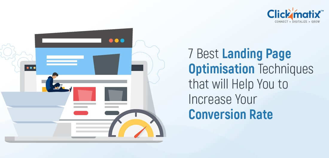
Ever wondered why you sometimes can’t stop yourself from watching another movie, reading another article or subscribing to a site because of its impressive content?
Just like businesses that are able to quickly fulfill their customers’ needs without emptying their pockets, landing pages that offer users exactly what they need will have a higher chance of attracting a stronger and wider audience than others.
Search engines are where users hope to find their final browsing destination. They search for what they are looking for in their chosen search engine using keywords, and the search engine displays the relevant results and possible solutions. From there, users tend to click on one of the first 3 results. Once they’ve clicked on a page and left the search engine, it’s up to the landing page to provide the information the user is looking for and convert them into a customer.
Not all landing pages can convert users, but the ones directly offering what users are looking for are more likely to achieve higher conversion rates.
In this article, we’ll discuss 7 of the best techniques you can utilise to optimise your landing pages, increase conversion rates and reduce your cost per acquisition.
Let’s plunge in!
1. Write a Compelling Headline
Headlines are the first thing a user sees when they click through to your site from a search engine. In fact, only 2 out of every 10 people continue to read after the headline.
Your headline decides whether the visitor reads further or not. The key goal of a headline is to generate curiosity in users and encourage them to read further and learn more.
Here are some tips to follow if you want to create a headline that compels visitors to read more:
- Keep it simple yet attractive: Being creative with your headline doesn’t mean you have to include complicated words. A simple headline is much more persuasive than a complicated one. It just needs to serve a purpose to attract visitors.
- Promise: Users came in search of a solution to their problem. Promise to solve their problem via headline. For example, ‘In 10 minutes, we will teach you how to be extra productive’.
- Use title case: Make your headline stand out with a title case and subhead case for subheadings.
- Be creative: Try news style headlines: ‘Gene Breakthrough Restores the Sight of People with Inherited Eye Disease and Could Save Thousands from Blindness’.
- Use selling words: Free, discount, secret, guaranteed, quick, etc.
- Try some humor: If possible, keep things light, for example: ‘Cows lose their jobs as milk prices drop’.
- Start with ‘How to’s or a list of ‘Top 10’.
Use these ideas for a quick start, but don’t limit yourself to them. Explore more, experiment more, and get as creative as you can to generate out-of-the-blue headlines that entice people to click.
2. Display Trust indicators
Visitors want assurance that you’re legit, safe, and secure in the world of hackers. Trust indicators like client testimonials, reviews, and other social endorsements increase the level of trust among new visitors.
Here’s a trust-boosting testimonial example:
‘Not only did SyncMarketing help in taking my website’s ranking up, but they also showed the holes in our web design and marketing strategies that were responsible for massive time and money waste. By successfully filling those holes, we achieved 75% more ROI than before.’ – Oliver Beek, CEO of LiveOAKfitness.com (supported by an image of the CEO).
Notice how the detailed testimonial, supported by full name, business name, and an image shows the benefits the client is enjoying when connected with your product or service. Testimonials like these are more convincing than a one-line statement.
If your customers still feel insecure after reading such testimonials, trust badges are the next weapon to use on your landing page.
Trust badges are too common these days. After testimonials, trust badges act as a final touch that increases trust among users.
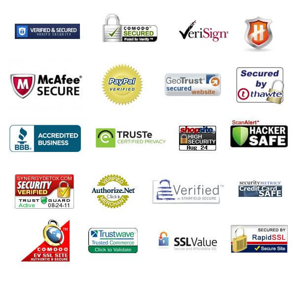
ActualInsights.com conducted a study a few years back asking users which badges they trust the most.
Here are the most common badges consumers admitted to trusting:
If you don’t have trust badges, it’s time to make a place for them before users run to your competitors.
3. Optimise Call to Actions
After catching the attention of users and building a level of trust, CTA (call to action) comes into play to take users toward the final action. After all, for the sake of this final action, you upgraded up your site with content, testimonials, and trust badges.
An effective CTA is the perfect combination of relevancy and value. The best way to achieve such a combination is by focusing on relevance and users’ values. For example, just a ‘submit’ as a CTA doesn’t convey much and also makes users think ‘If I submit, then what?’. On the other hand, telling users in advance what they achieve after submitting their email ID is a more successful approach.
Here’s an interesting call-to-action with some details added to clarify why users shouldn’t miss the deal:

Get weekly insights for revenue-shifting results
Sign up for our newsletter and be the first one to know about our exclusive offers, digital marketing news and updates.
|
|
Thank you for Signing Up |


Follow these suggestions to create a couple of CTAs for various landing pages:
- Use a visible font colour
- Use ‘you’ or ‘your’ instead of ‘my’ or ‘me’
- Don’t tell visitors what they have to do. Instead, tell them what they’ll get
- Use pointing arrows to shed some light on CTAs
4. Offer Live Help
The easiest way to help your prospects in need ( when they decide to purchase but have some questions left and would prefer to approach a human) is to insert a live chat.
Today, with everything available at our fingertips, nobody likes to pick up the phone and call, let alone send emails and wait for days to get a response. Such tasks may change the mind of your users and make them jump to competitors.
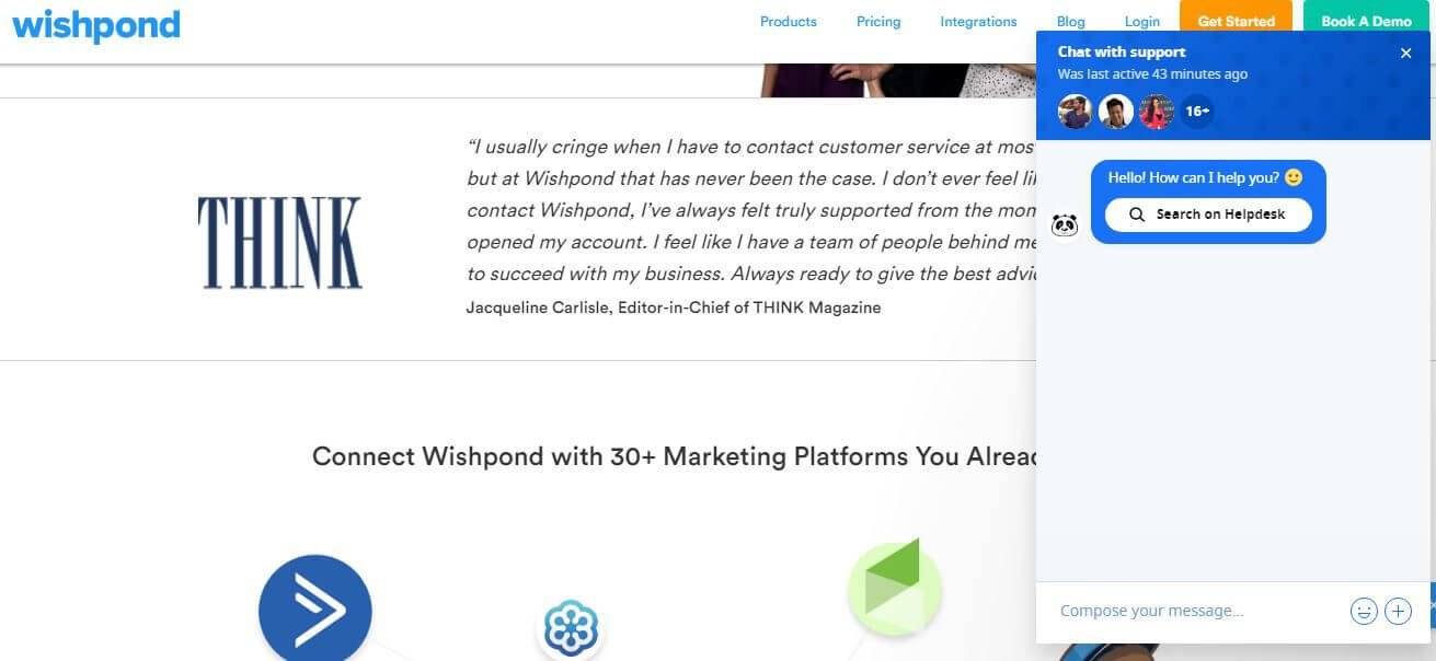
Live chat eliminates all the lengthy processes and gives users a direct way to connect with customer service executives and have their queries solved. In fact, you may have noticed a popup rising at the corner of a landing page while visiting many sites that ask if they could help.
Look at this live chat I found on Wishpond:
With live chat options, you are not asking for users’ personal information like their email or phone number. You are simply helping them without asking for anything in exchange, which further enhances their confidence in your site. Once users get their answers from real humans on live chat, you won’t believe how many conversions you make without even asking.
5. Guide Users with Directional Cues
There’s a universal writing rule: ‘Don’t tell users, instead show them’.
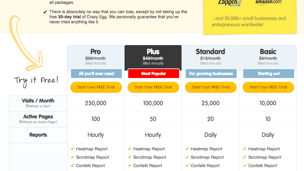
The same rule applies to your landing pages too. Instead of telling users where to go, show them or guide them using directional cues like finger pointers. Finger pointers move users’ attention wherever they want. You can either take users directly to the CTA or direct them around your entire website. For example, you may direct them towards an essential piece of information, then a case study revealing the benefits others are enjoying and, at last, to an effective CTA.
Here’s an example of CrazyEgg’s pricing page with a directional cue like an arrow:
6. Leverage Video Explainers and Sliders
Have you ever seen those whiteboard animated videos that explain everything within 1 and 3 minutes? Or, rather, they compress an entire topic into a video and explain it so well that you never really need to read further?
That’s the power of explainer videos.
Today’s users are more scanners than readers. They want to consume loads of content in the least time possible. They are challenging marketers to create videos that explain everything without sacrificing any essential information for the sake of time. Animated explainer videos help marketers and website owners accept the challenge and create masterpieces.
And if done well, you can enjoy a 30% increase in conversion rates.
But why are videos so effective?
The answer lies behind users’ attention span.
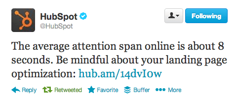
Users’ attention spans are continually declining as we are surrounded by tons of information from all directions. The increasing usage of mobile phones is the key reason why users are bombarded with information.
In such scenarios, videos come handy because they are easy to consume and understand within minutes. They even trigger emotions because of their visual power.
Putting an explainer video spares users from reading content. And, if you can’t afford it, image sliders are also an excellent option.
7. The Art of Content Placement
By now, you know what to include on your landing page. The only problem is you may end up inserting too much to digest or fit on one page. In short, you may create a mess. That’s why you need to learn the art of content placement.
Well, it doesn’t require much rocket science. Imagine how many things you would like to keep in a room, and how much empty space is needed to roam around freely. Apply similar rules on your landing page, and you are good to go.
Sometimes you have to eliminate unnecessary elements to improve the experience and make it easy to understand at first glance.
You Got it Covered
When you achieve success in creating a converting landing page, make sure users are going to talk to their friends about it, which will help you generate more leads. Before you know it, you’ll have already become a source of inspiration for all.
In search for strategic sessions?
Let us understand your business thoroughly and help you
strategies your digital product.
It's time to call your business-
a brand!
Australian Owned Agency
Save Time and Money
Unbeatable Value
Where Work Gets Done
free Ecommerce SEO guide for Higher Sales & Conversion


THE ULTIMATE MARKETING GUIDE FOR LAWYERS


Youtube Ads Guide How to Advertise on Youtube


free Ecommerce SEO guide for Higher Sales & Conversion


It's time to call your business-
a brand!
Australian Owned Agency
Save Time and Money
Unbeatable Value
Where Work Gets Done


The Game-Changing Ecommerce SEO Guide That Will Blow Your Mind & Sales
With this Ecommerce SEO Guide, you'll be able to:
- Develop a Ecommerce SEO strategy.
- Build a content marketing strategy that aligns with your business goals.
- Convert your website visitors into paying customers.


Youtube ads guide how to advertise on youtube
With this Youtube ads Guide, you'll be able to:
- Develop a Youtube ads strategy.
- Build a type of ads of your own that aligns with your business goals.
- Generate revenue from youtube ads.
It's time to call your business-
a brand!
Australian Owned Agency
Save Time and Money
Unbeatable Value
Where Work Gets Done


 Australian Owned Agency
 Save Time and Money
 Unbeatable Value
 Where Work Gets Done
