A high bounce rate can be a silent killer for your website’s success. When visitors leave after viewing just one page, it signals dissatisfaction or misalignment with their expectations. Understanding how to reduce bounce rate is essential to keeping users engaged, boosting SEO rankings, and driving more conversions.
This guide explores 10 actionable strategies to tackle bounce rate effectively, ensuring your website is optimised for both user experience and performance.
What is Bounce Rate and Why Does it Matter?
Bounce rate refers to the percentage of visitors who leave your website after viewing only one page. At the same time, it may seem like a minor statistic, but a high bounce rate can signal underlying problems that affect your website’s performance and success.
Why is a High Bounce Rate a Problem?
- Poor User Experience: When users quickly exit your site, it suggests they didn’t find the content, design, or navigation helpful or engaging.
- SEO Impact: Search engines view high bounce rates as a sign of low-quality or irrelevant content, potentially lowering your rankings in search results.
- Lost Opportunities: When visitors leave without exploring further, your chances of converting them into leads, customers, or subscribers are diminished.
Addressing factors that contribute to a high bounce rate, such as slow load times or unclear navigation, can create a better user experience. A lower bounce rate not only signals to search engines that your website is relevant but also helps retain visitors longer, increasing the likelihood of conversions. Improving the bounce rate boosts user satisfaction, strengthens your SEO strategy, and drives business growth.
Understand Your Current Bounce Rate
Before making improvements, it’s vital to understand your current bounce rate. This insight helps you identify problem areas and set realistic goals.
How to Check Bounce Rate
- Tools like Google Analytics make it simple to measure bounce rates:
- Go to Audience > Overview to see the overall bounce rate for your site.
- For detailed, page-specific insights, navigate to Behavior > Site Content > All Pages.
Benchmarking Bounce Rates
Bounce rates vary significantly by industry, so it’s important to compare your metrics against relevant benchmarks:
- Retail/E-commerce: 20-40%
- Blogs: 65-90%
- Service Websites: 10-30%
For example, if you run an e-commerce site and your bounce rate is above 40%, it’s a sign of potential issues like slow load times or confusing navigation. On the other hand, a high bounce rate for blogs might be expected due to their nature of providing quick, targeted information.
Optimise Website Loading Speed
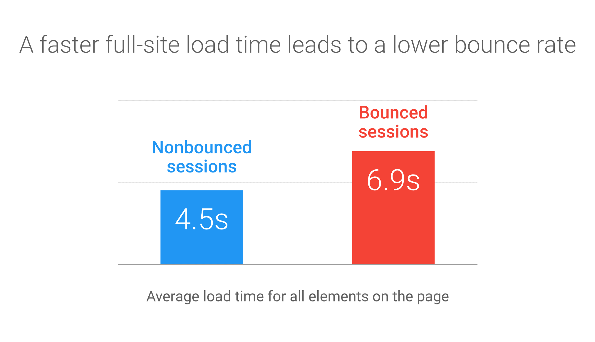
A slow-loading website is one of the biggest reasons visitors leave within seconds. In today’s fast-paced digital world, speed isn’t just a luxury—it’s a necessity. A delay of even a few seconds can frustrate users, leading to higher bounce rates and lost opportunities.
How to Reduce Page Load Time
- Compress Images: Large image files can significantly slow down your website. Use tools like TinyPNG or ImageOptim to reduce image sizes without compromising quality. This simple step can have a noticeable impact on loading speed.
- Use a Content Delivery Network (CDN): A CDN distributes your content across multiple servers worldwide. This allows users to access your site from the server closest to their location, reducing load times and improving performance.
- Minimise Server Response Time: Optimising your server’s configuration can dramatically reduce response time. Consider reducing HTTP requests, streamlining code, and using faster hosting options to ensure a quicker server response.
- Leverage Browser Caching: Enable browser caching to store static resources like images, stylesheets, and JavaScript files on users’ devices. This ensures faster loading for returning visitors and improves the overall user experience.
Improve Website Design and Navigation
First impressions are everything, especially in the digital world. A cluttered, disorganised, or confusing website can deter visitors almost instantly, causing them to leave without exploring further. Ensuring your site has a user-friendly design reduces bounce rates and keeps visitors engaged.
Tips for User-Friendly Design
- Simplify Navigation: A clear and intuitive navigation structure is crucial for guiding visitors through your website. Use well-organised menus, descriptive labels, and breadcrumbs to help users find what they need with minimal effort. Avoid overwhelming visitors with too many options, and keep key information accessible within a few clicks.
- Prioritise Mobile-Friendliness: Your website must be responsive, as a significant part of internet traffic comes from mobile devices. A mobile-friendly site adapts seamlessly to different screen sizes, ensuring users on smartphones and tablets enjoy the same smooth experience as those on desktops.
- Focus on Visual Appeal: Design isn’t just about looking good—it’s about creating a comfortable browsing experience. Use whitespace strategically to reduce clutter and improve readability. Maintain consistency in fonts, colours, and button styles across your site for a cohesive and professional look. An aesthetically pleasing layout creates a sense of trust and encourages users to explore further.
Focus on High-Quality, Relevant Content
Content is the cornerstone of any successful website, but it only works if it aligns with your audience’s needs and expectations. When visitors find valuable, engaging, and relevant information, they are more likely to stay, explore, and return, reducing your bounce rate and boosting conversions.
Key Practices for Better Content
- Stay Relevant: Understand your target audience and create content that addresses their specific questions, pain points, and interests. Research keywords and topics that resonate with your audience, ensuring your content offers practical solutions or insights. Relevance builds trust and keeps users engaged.
- Use Visual Elements: Walls of text can be overwhelming. Break up your content with visuals like images, infographics, charts, or videos. These elements enhance the reading experience and improve retention and engagement by presenting information in a more digestible format.
- Avoid Clickbait: Misleading titles might attract clicks, but they ultimately disappoint users when the content doesn’t deliver on its promise. This leads to frustration and quick exits. Instead, craft honest and compelling headlines that reflect the true value of your content.
Ensure Mobile Optimisation
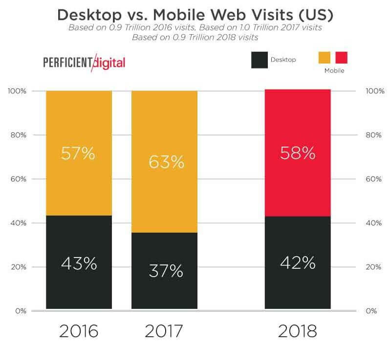
With more than half of all web traffic originating from mobile devices, a website that doesn’t cater to mobile users risks driving visitors away. A non-responsive design leads to poor usability, frustrating navigation, and ultimately, higher bounce rates. Prioritising mobile optimisation ensures your site delivers a seamless experience across all devices.
How to Optimise for Mobile
- Adopt a Responsive Design: Implement responsive layouts that automatically adapt to different screen sizes, whether it’s a smartphone, tablet, or desktop. This ensures your content looks and functions perfectly, no matter the device.
- Simplify Forms and Buttons: Mobile users prefer convenience. Minimise form fields to reduce frustration during data entry, and use large, easily clickable buttons for navigation and actions. This improves the overall usability and encourages visitors to stay engaged.
- Test Across Multiple Devices: Regularly test your site’s performance on various mobile devices to identify issues like slow loading times, misaligned elements, or broken functionality. Tools like Google’s Mobile-Friendly Test can help ensure your site meets user expectations.
Use Internal Linking Effectively
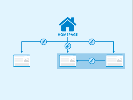
Internal links act as navigational breadcrumbs, guiding visitors seamlessly through your website. By strategically linking to relevant pages, you can enhance user experience, boost engagement, and reduce bounce rates.
Why Internal Linking Matters
- Boosts Engagement: Internal links encourage visitors to explore more of your content by directing them to related pages or resources. For example, if a user is reading a blog on website design, an internal link to a guide on improving user experience can add value, increasing their time on your site and reducing the likelihood of a quick exit.
- Improves SEO: Search engines view internal links as signals of your site’s structure and content hierarchy. Well-linked pages are easier to crawl and index, enhancing your site’s visibility and ranking potential. Additionally, internal linking helps distribute link equity across pages, strengthening your site’s overall SEO performance.
Tips for Effective Internal Linking
- Add Value Through Context: Link pages that enhance the reader’s understanding or provide deeper insights into the topic. For instance, a link to a “mobile optimisation checklist” from a blog on reducing bounce rates can offer practical next steps.
- Use Descriptive Anchor Text: Avoid generic terms like “click here.” Instead, use clear, descriptive anchor text that tells readers and search engines what to expect, such as “Learn how to improve website speed.”
Smart internal linking keeps users engaged and helps create a more interconnected, SEO-friendly website.
Include a Clear Call-to-Action (CTA)
Visitors often leave a website because they are unsure what action to take next. Clear and well-placed calls to action (CTAs) serve as a roadmap, guiding users toward meaningful engagement—whether it’s signing up for a newsletter, exploring more content, or making a purchase. Effective CTAs can significantly reduce bounce rates and keep users actively interacting with your site.
Best Practices for CTAs
- Be Specific: A vague CTA like “Click Here” doesn’t inspire action. Use clear, actionable language that aligns with the visitor’s intent, such as “Sign Up for Free,” “Download the Guide,” or “Shop the Sale.” Specific CTAs help set expectations and make the desired next step obvious.
- Position Strategically: CTAs should align with the user’s journey. Place them in areas where visitors are likely to need direction, such as at the end of a blog post, on product pages, or within navigation menus. Ensure they feel natural and non-intrusive.
- Make Them Stand Out: Use contrasting colors, bold fonts, and ample whitespace to draw attention to your CTAs. However, maintain consistency with your site’s overall design to avoid them feeling out of place.
Minimise Pop-Ups and Distractions
While pop-ups can be an effective way to capture attention or offer promotions, they can also be disruptive if not used thoughtfully. Excessive pop-ups or autoplay ads can overwhelm users and lead to higher bounce rates. To ensure your pop-ups contribute positively to user experience, it’s important to use them strategically and sparingly.
Best Practices for Pop-Ups
- Time Them Strategically: Instead of showing a pop-up immediately when a visitor lands on your page, wait until they’ve spent some time on the site. This allows them to engage with the content first, making them more likely to appreciate an offer or newsletter sign-up rather than feeling bombarded.
- Keep Them Subtle: Avoid intrusive, full-screen pop-ups that can frustrate users. Use smaller, less disruptive pop-ups, such as those that appear at the bottom of the screen or as exit-intent pop-ups when the user is about to leave.
Reducing unnecessary distractions like pop-ups helps keep visitors engaged with your content, resulting in a lower bounce rate and a more enjoyable user experience.
Leverage Exit-Intent Strategies
Exit-intent pop-ups are powerful tools that detect when visitors are about to leave your website and give you one final opportunity to capture their attention before they bounce. If used strategically, these pop-ups can significantly reduce bounce rates and increase conversions.
Ideas for Exit-Intent Pop-Ups
- Offer Discounts: Providing an exclusive discount or promotional offer can encourage a user to stay and complete a purchase. For example, offering 10% off their first order might convince a potential customer to take action rather than leave the site.
- Gather Feedback: Asking users for feedback about why they’re leaving can provide valuable insights into potential improvements for your site. A simple “Why are you leaving?” pop-up can help you identify user pain points.
- Promote Content: Use exit-intent pop-ups to suggest relevant content or redirect visitors to other valuable pages on your site. Offering them more resources can keep them engaged and prevent them from leaving too soon.
Regularly Update and Test Your Website
To maintain a high-performing website and reduce bounce rates, it’s crucial to consistently update and optimise your site. Websites that remain stagnant or out-of-date can quickly lose relevance, causing visitors to leave. Regular maintenance ensures your site remains functional, engaging, and aligned with user expectations.
Best Practices for Regular Updates
- Perform A/B Testing: Regularly test different elements of your site, such as layout, content, or calls-to-action (CTAs). A/B testing helps you determine which versions resonate best with your audience, improving user engagement and lowering bounce rates.
- Update Content: Outdated content can cause users to lose trust in your site. Regularly refresh blog posts, product information, and other key pages to ensure they remain relevant and valuable to visitors.
- Monitor Metrics: Use analytics tools to track user behaviour and monitor metrics like bounce rate and time on the page. This data helps identify areas for improvement and optimise your site accordingly.
Conclusion
Reducing bounce rate is about creating a seamless, engaging, and value-driven experience for your visitors. By optimising speed, design, content, and navigation, you can ensure users stay longer and interact with your site. Implementing these 10 strategies will not only reduce bounce rates but also enhance your website’s performance, SEO rankings, and conversion rates.

Get weekly insights for revenue-shifting results
Sign up for our newsletter and be the first one to know about our exclusive offers, digital marketing news and updates.
|
|
Thank you for Signing Up |


Start implementing these tips today and watch your website’s bounce rate drop while user satisfaction soars!
In search for strategic sessions?
Let us understand your business thoroughly and help you
strategies your digital product.
It's time to call your business-
a brand!
Australian Owned Agency
Save Time and Money
Unbeatable Value
Where Work Gets Done
free Ecommerce SEO guide for Higher Sales & Conversion


THE ULTIMATE MARKETING GUIDE FOR LAWYERS


Youtube Ads Guide How to Advertise on Youtube


free Ecommerce SEO guide for Higher Sales & Conversion


It's time to call your business-
a brand!
Australian Owned Agency
Save Time and Money
Unbeatable Value
Where Work Gets Done


The Game-Changing Ecommerce SEO Guide That Will Blow Your Mind & Sales
With this Ecommerce SEO Guide, you'll be able to:
- Develop a Ecommerce SEO strategy.
- Build a content marketing strategy that aligns with your business goals.
- Convert your website visitors into paying customers.


Youtube ads guide how to advertise on youtube
With this Youtube ads Guide, you'll be able to:
- Develop a Youtube ads strategy.
- Build a type of ads of your own that aligns with your business goals.
- Generate revenue from youtube ads.
It's time to call your business-
a brand!
Australian Owned Agency
Save Time and Money
Unbeatable Value
Where Work Gets Done






 Australian Owned Agency
 Save Time and Money
 Unbeatable Value
 Where Work Gets Done