Essential Tips to Offer a Positive User Experience for Your Business
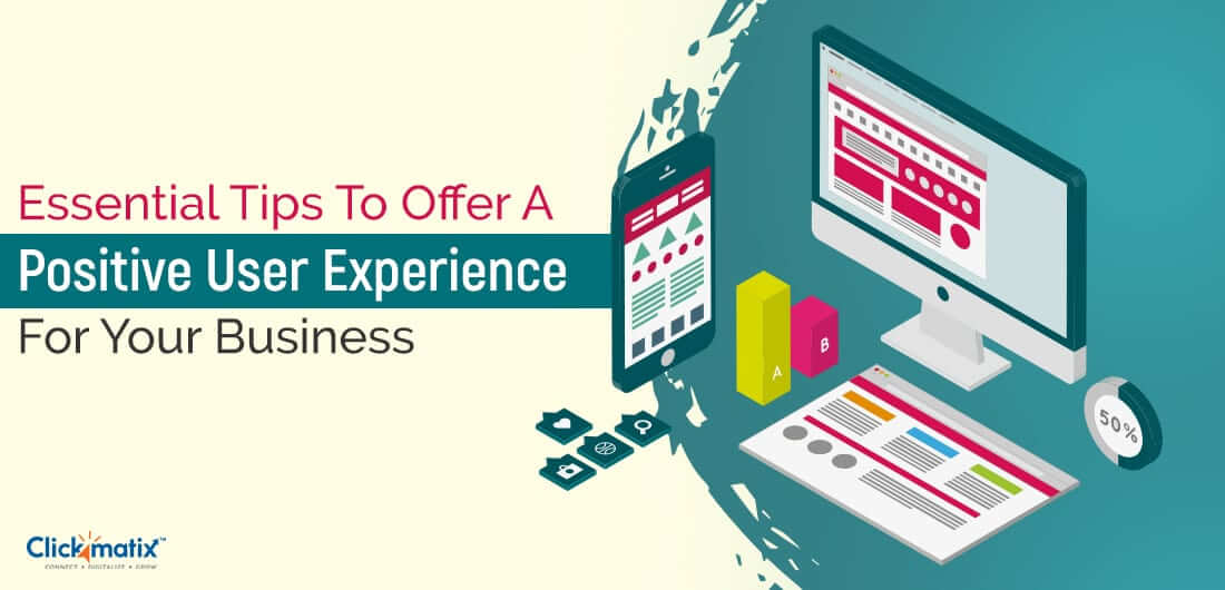
We always talk about offering an excellent user experience, but how much attention do we actually pay to do it?
In today’s digital age, users have more choices than ever when it comes to online purchases. Almost all the products or services you could imagine are available at your fingertips. Therefore, you must find a way to convince users to choose your business’ website over others.
But how do you do it? The most obvious answer is the user experience!
But today, we won’t only tell you to deliver an excellent user experience, but we’ll also show you how to do it.
Before we plunge into designing an engaging user experience, let’s shed some light on its importance. A positive user experience resides at the core of high-quality web design. It creates communication between a brand and its users, which later turns into a final purchase (i.e. conversion).
In fact, 71% of online businesses credit superior UX for their success. They believe that a powerful user experience makes them stand out from the crowd and attract maximum online traffic.
What’s more incredible is that users are influenced by the smallest details that are often overlooked while planning your web design, which is one of the key challenges for web designers.
With this in mind, you’re now well aware of why your website needs a kickass design!
Here are 5 tips to help you improve upon your business website to provide an effective and competitive user design.
1. Create an All-Inclusive, Responsive Design
Have you ever checked your website on multiple devices?
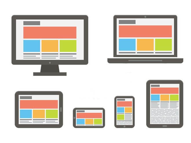
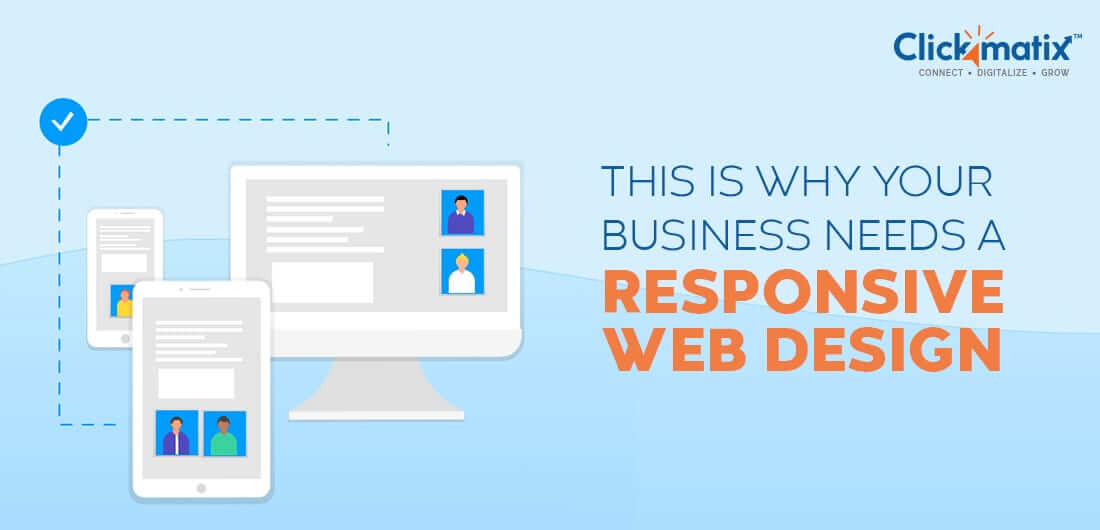
If not, it’s time to open your website on various devices as a user and see how it works. While checking your website, keep in mind the vast difference between a site that just works on multiple screens and a site that adapts itself to the screen. Responsive design means creating a website that fits and adjusts to any screen size.
A working website may not offer a good experience to users browsing on all screen sizes. Content may be hard to read or visuals may not be working well. On the other hand, a responsive website provides a layout that aligns perfectly and makes the content adjustable to any screen for an easy-to-understand user experience.
The below image will explain how a responsive website adjusts its design and content for each screen size, which a normal website fails to do.
Creating a responsive website takes time, effort, and loads of coding. A single premade theme or template isn’t capable of offering accurate results. It’s better to hire an experienced web design and SEO agency to develop a website based on your business and users’ requirements.
2. Focus on High-Quality, Relevant and Valuable Content
Once your website has been prepared with responsive components, switch your focus to the content itself.
Ask yourself:
- Is your creating content that adds value to users’ lives?
- Is your content relevant to both your business and to users?
- Is your content high quality (e.g. furnished with research, stories, facts, etc.)?
- Is it optimised for SEO?
If you can answer ‘yes’ to all 3 questions, then your user experience has a solid foundation. Valuable content makes users come to your business instead of making you go to them. Informative articles not only satisfy visitors but also help your site rank higher on search engines.
Tip: Create content that shares actionable advice, tips, or answers.
Finally, don’t stick to words only. Decorate your content with images, videos, or audio clips so users will have the option to absorb your content in their preferred method. Visuals make your content more entertaining and easier to digest, which further enhances the user experience. One effective way to ensure users remain engaged on your website is by offering high-quality, relevant content. For example, gaming enthusiasts searching for the best mods for Minecraft would appreciate well-researched and updated guides. Underground gems like “Alex’s Mobs” or essential mods such as “Optifine” add substantial value—which keeps users returning and elevates their experience.
3. Increase Your Speed
One way to deliver an unbeatable user experience is to design a website with high loading speeds. Users are impatient these days. In fact, mobile users are quick to close sites that fail to load within 3 seconds.
The more time your website takes to load, the higher your bounce rate jumps (the more quickly users leave your site).
As everything is available at users’ fingertips, it doesn’t take much time for them to close a slow site and open another site to get their answers as quickly as possible.
If your site loads content in 3 seconds or less, users are more likely to stay. They may even get curious and check out more pages simply because your site loads faster than others.

Get weekly insights for revenue-shifting results
Sign up for our newsletter and be the first one to know about our exclusive offers, digital marketing news and updates.
|
|
Thank you for Signing Up |


Follow the below tips to stay on top of your website’s loading speed:
- Choose the fastest hosting service provider with authentic and solid hardware
- Reduce the size of visuals (e.g. images, videos) without affecting their quality
- Use a content delivery network to duplicate the static elements of your site
- Try to find the individual sections that are slowing down your site and work on them
Following these tips consistently will help you create a faster site for your visitors.
Note: Each change you make to your website will also affect its speed. Keep this in mind to ensure the changes you make are not slowing down your site.
4. Leave Some White Space
If your site lacks white space, it may be confusing for users to find your content, which will make them leave earlier.
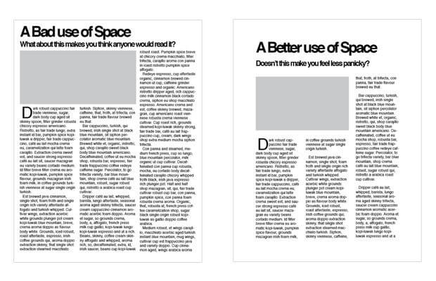
White space is made up of the empty portions of a website. It includes space between the lines, graphics, columns, objects, content, and other elements. A site with too many visuals wrapped in too much content looks like a crowded marketplace where no individual store is visible to the naked eye. Therefore, nothing is smooth or comprehensive enough to drive users towards the final call-to-action.
A positive user experience is not about overburdening your users with too much content. It’s about maintaining a perfect balance between your content and white space. Empty space between the content gives your users a break to digest what they’ve read while allowing them to read further without straining their eyes.
Take a look at this difference between an unbalanced and balanced use of space by HubSpot.
A simple layout and an eye-friendly design are like an open invitation for users to comfortably enjoy your content and will attract more traffic in the long term.
5. Offer Easy Navigation
Since we already know that a huge amount of traffic comes from mobile devices, you must prepare your site for finger-comforting swipe gestures, menus, banners, and other mobile-oriented objects. Easy fingertip navigation will help mobile users explore your website more.
For smaller screens, display essential elements that take up less space first. For bigger screens, display the most important things at the center of the page without cluttering the space. Take similar care for font sizes as well. Adjustable font sizes for every screen balance the ratio of words in paragraphs and headers.
In Conclusion
As per PwC’s research, nearly one-third of customers turn their backs on a brand after a bad experience. Furthermore, around 54% of customers are not satisfied with the UX of many online brands.
Your top priority is your customer’s happiness. Now that you know how much user experience affects them, implement the above tips to improve all areas of your website, and don’t let consumers’ leave without taking some action.
In search for strategic sessions?
Let us understand your business thoroughly and help you
strategies your digital product.
It's time to call your business-
a brand!
Australian Owned Agency
Save Time and Money
Unbeatable Value
Where Work Gets Done
free Ecommerce SEO guide for Higher Sales & Conversion


THE ULTIMATE MARKETING GUIDE FOR LAWYERS


Youtube Ads Guide How to Advertise on Youtube


free Ecommerce SEO guide for Higher Sales & Conversion


It's time to call your business-
a brand!
Australian Owned Agency
Save Time and Money
Unbeatable Value
Where Work Gets Done


The Game-Changing Ecommerce SEO Guide That Will Blow Your Mind & Sales
With this Ecommerce SEO Guide, you'll be able to:
- Develop a Ecommerce SEO strategy.
- Build a content marketing strategy that aligns with your business goals.
- Convert your website visitors into paying customers.


Youtube ads guide how to advertise on youtube
With this Youtube ads Guide, you'll be able to:
- Develop a Youtube ads strategy.
- Build a type of ads of your own that aligns with your business goals.
- Generate revenue from youtube ads.
It's time to call your business-
a brand!
Australian Owned Agency
Save Time and Money
Unbeatable Value
Where Work Gets Done




 Australian Owned Agency
 Save Time and Money
 Unbeatable Value
 Where Work Gets Done