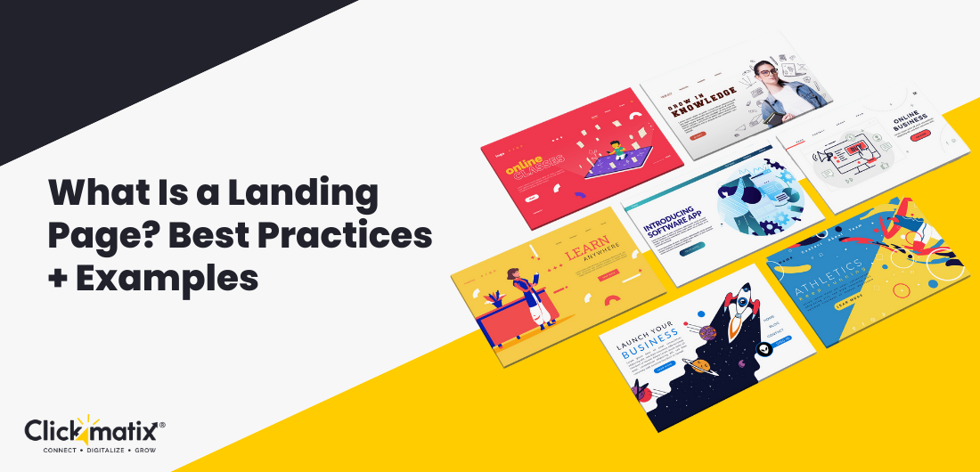
Is your website falling short? Are you struggling to convert visitors into customers? It might be time for a high-performing landing page.
But what exactly is a landing page? And why is it so important?
Here, we’ll break down the concept of landing pages, explore their purpose, and share proven best practices for creating high-converting pages. By the end, you’ll understand how to optimise your landing pages and see some inspiring examples that showcase their power.
Let’s go!
What Is a Landing Page?
Have you ever been to a flea market? You have a specific item in mind, but there’s a lot of stuff everywhere. It’s hard to find what you’re looking for, and you might get distracted by other things. A landing page is like having a personal shopper at a flea market. It helps you find the item you want without getting lost or distracted.
A landing page is a special web page designed to do one thing: convince people to take a specific action. It’s different from other web pages because it only has a few links or other things that might confuse people. Its only goal is to get people to do something, like sign up for a newsletter, download a document, or buy something. It’s the last step in the process of getting people to do what you want. They serve as targeted, dedicated destinations that bridge the gap between a user’s initial interest and their final decision.
Role in Marketing Campaigns
Think of landing pages as the “call to action” of your marketing campaigns. When you run an ad on Google or social media, you need a specific place to send potential customers. This is where your landing page comes in. It’s designed to provide a seamless and relevant experience that aligns with the ad’s promise, increasing the chances of conversion.
Impact on Conversion Rates
A well-optimised landing page can boost your conversion rates. Unlike a generic homepage, which serves multiple purposes, a landing page focuses solely on one goal: getting the visitor to take a desired action. By eliminating distractions and providing a clear path, effective landing pages can achieve conversion rates that exceed those of other pages.
Benefits for Businesses
Landing pages are essential for maximising your marketing efforts. They provide a focused, personalised experience that can drive conversions and help your business achieve its goals. For businesses, the benefits of using landing pages are clear:
- Targeted Messaging: Deliver highly specific messages that resonate with your target audience.
- Better Analytics: Track and analyse user behaviour more effectively to refine your strategies.
- Flexibility and Experimentation: Test different landing page elements to optimise your results.
How Do Landing Pages Work?
Understanding how a landing page works is crucial to utilise its full potential. The journey typically begins with a user clicking on a paid ad, an email link, or a social media post. This click leads them to the landing page, where they’re met with content that aligns perfectly with the message of the original ad or link.
The User Journey
The journey from ad click to conversion is designed to be as smooth as possible. Here’s how it typically works:
- Ad Click: A user clicks on an ad or link that promises something of value (e.g., a discount, a free resource, or exclusive content).
- Landing Page Arrival: The user is directed to a landing page that reinforces the ad’s promise with a compelling headline, supporting copy, and a clear CTA.
- Decision Point: The user evaluates the offer presented on the landing page. If the page effectively communicates value and addresses any potential objections, the user is more likely to take the desired action.
- Conversion: The user completes the action (e.g., fills out a form, makes a purchase), achieving the page’s objective.
Problem: Sometimes, landing pages are hard to understand or don’t match the ad’s promise. This can confuse people and make them less likely to buy.
Solution: Make sure your landing pages are appealing and easy to use and tell people what you offer. The headline should be catchy, the text should be simple and convincing, and the call to action should be big and easy to find.
What Makes a Homepage Different from a Landing Page?
While they might look similar, homepages and landing pages serve distinct purposes.
Homepages introduce visitors to your brand and offer various paths to explore. They’re designed to provide an overview of your business and its offerings.
Landing pages focus on a single goal: driving a specific action, such as signing up for a newsletter or purchasing. They’re used for marketing campaigns and are designed to be highly targeted and persuasive.
Key Differences
- Purpose: Homepages provide a general introduction while landing pages focus on a specific action.
- Navigation: Homepages have a comprehensive navigation menu while landing pages often lack navigation to minimise distractions.
- Content: Homepages showcase a wide range of content while landing pages present targeted, concise content that supports the conversion goal.
When to Use Them
- Homepages: Ideal for introducing visitors to your brand and offering multiple entry points. Think of it as your company’s digital storefront.
- Landing Pages: Best used for marketing campaigns where you want to drive a specific action, such as promoting a limited-time sale or offering a free trial.
Homepages are your website’s main hub while landing pages are focused tools for driving conversions. Understanding the differences will help you create a more effective website that meets your visitors’ needs and achieves your business goals.
Types of Landing Pages
- Lead Generation Landing Pages
These pages collect visitor information (like names and emails) in exchange for offers like eBooks or free trials. The goal is to convince visitors to share their details.
A bad lead-generation landing page can waste traffic and marketing efforts. Create a page with a clear message, a strong call to action, and a simple form. Use social proof (like reviews) to build trust.
- Click-Through Landing Pages
These pages warm up visitors before sending them to a final destination, often a sales page. They provide a taste of what’s to come.
A click-through page that doesn’t lead visitors to the sales page can lose conversions. Use a clear headline, a strong visual design, and a relevant call to action. Make sure the page’s content matches the final destination’s content.
Get weekly insights for revenue-shifting results
Sign up for our newsletter and be the first one to know about our exclusive offers, digital marketing news and updates.
|
|
Thank you for Signing Up |


- Product Launch Landing Pages
These pages introduce new products and often include a “Buy Now” button or a pre-order form. The goal is to create excitement and encourage sales.
Use high-quality images or videos to showcase the product. Highlight its unique features and benefits. Create a sense of urgency or exclusivity with limited-time offers or incentives.
- Event Registration Landing Pages
These pages encourage people to sign up for events like webinars, conferences, or workshops. They usually provide details about the event, its benefits, and a registration form.
Provide clear information about the event, including date, time, location, and agenda. Use social proof (like reviews from past attendees) to build credibility. Make the registration process easy and simple.
How to Create a Landing Page
Here’s a simple guide to creating a landing page that works:
- Know Your Goal
Before creating your page, ask yourself: What do you want people to do on this page? Do you want to sell more things, get more people to contact you, or just make people familiar with your brand? A clear goal will help you decide what to include on your page.
- Understand Your Customers
Who are you trying to reach? What do they need, what problems do they have, and what do they want? The more you know about your customers, the better you can make your landing page for them.
- Look at What Others Are Doing
See what your competitors are doing with their landing pages. What works well? What doesn’t? This can help you learn from others and avoid mistakes.
- Choose a Landing Page Builder
There are many landing page builders out there, each with its own good and bad points. Think about how easy they are to use, how much they cost, and what they can do when you’re choosing one.
- Find a Web Host
Your landing page needs a place to live online. Choose a good web host that can handle your traffic and stays up most of the time.
- Pick a Domain Name
Your domain name is your website’s address. Ensure it’s easy to remember, relevant, and spell.
- Make Your Content and Design
This is where you combine words and pictures. Your content should be interesting, helpful, and what your customers want. The web design should be clean, look good, and be easy to use.
- Connect Your Other Tools
Once your landing page is ready, you’ll need to connect it to your email marketing software, analytics tools, and other things you use.
- Test and Fix
Before launching your landing page, test it carefully to ensure it works as intended. Then, use analytics to monitor its performance and make changes if necessary.
A great landing page is more than just a pretty design. It’s a helpful tool that can help you reach your business goals. By following these steps and thinking about your customers, you can make a landing page that works well.
Optimising a landing page
Creating an effective landing page involves a mix of strategic planning and creative execution. Here’s a step-by-step guide on how to optimise a landing page that converts.
- Clear and Compelling Headline
Your headline is the first thing visitors see. It should be clear, and compelling, and immediately communicate the value of your offer. Avoid jargon and focus on what the user stands to gain.
- Concise and Persuasive Copy
Your copy should be concise but persuasive. Use language that resonates with your target audience, focusing on the benefits rather than just features. Bullet points can help break up text and make it more digestible.
- Strong and Visible CTA
The CTA is the most critical element of your landing page. Make it strong, visible, and action-oriented. Phrases like “Get Started” or “Claim Your Free Trial” are direct and effective.
- High-Quality Images and Visuals
Visuals should support the content, not distract from it. Use high-quality images that are relevant to your offer. A hero image can be particularly effective in grabbing attention and conveying your message at a glance.
- Mobile Responsiveness
Ensure your landing page is fully optimised for mobile devices. This includes using a responsive design, compressing images for faster load times, and making forms and buttons easy to use on smaller screens.
- A/B Testing
Continuous improvement is key to landing page success. Use A/B testing to compare different versions of your page and determine what works best. Test elements like headlines, CTAs, images, and colour schemes.
By following these best practices, you can create a landing page that converts visitors into customers. Remember, landing page optimisation is an ongoing process. Keep testing and refining your page to achieve the best results.
Additional Landing Page Examples to Inspire You
Example 1: Spotify’s Free Trial Offer
Spotify’s landing page for its free trial offer is a masterclass in simplicity. The headline is direct: “Try Premium free for 3 months.” The page is visually appealing, with a hero image of the Spotify app in use. The CTA, “Get Started,” is prominently displayed in a contrasting colour, making it impossible to miss.
The copy is concise and focused on the benefits of Premium. Spotify highlights features like ad-free listening, higher audio quality, and offline playback. The page also clearly explains how the free trial works and what happens after the trial period ends.
Overall, Spotify’s landing page effectively communicates the value of its Premium subscription and encourages users to sign up for a free trial.
Example 2: Airbnb’s Host Sign-Up Page
Airbnb’s landing page for new hosts is inviting and informative. The headline, “Earn money as an Airbnb host,” immediately communicates the value proposition. The page includes a simple form to get started, testimonials, and a calculator to estimate earnings. The CTA, “Start Hosting,” is clear and action-oriented.
Airbnb’s page provides information on hosting requirements, guest expectations, and earning potential. The use of testimonials and a calculator helps to build trust and credibility. Airbnb’s landing page makes it easy for potential hosts to understand the benefits of hosting and take the next step.
Example 3: Dropbox’s Sign-Up Page
Dropbox’s sign-up page is minimalistic yet effective. The headline, “Simplify your life,” is followed by a short description of Dropbox’s benefits. The CTA, “Sign Up,” is the only action users can take, making the path to conversion clear and straightforward.
Dropbox’s page highlights the simplicity and convenience of using Dropbox to store and access files from anywhere. The minimalistic design and clear CTA make it easy for users to sign up and use the service.
Conclusion
Landing pages are an excellent tool for your digital marketing. They help turn visitors into leads, customers, or whatever you want. You can improve your conversion rates and marketing success by understanding what landing pages are for, the different kinds, and how to make them good.
Whether you’re launching a new product, promoting a webinar, or building your email list, a well-made landing page is important. Keep testing, refining, and improving your pages to ensure they work well!
In search for strategic sessions?
Let us understand your business thoroughly and help you
strategies your digital product.
It's time to call your business-
a brand!
Australian Owned Agency
Save Time and Money
Unbeatable Value
Where Work Gets Done
free Ecommerce SEO guide for Higher Sales & Conversion


THE ULTIMATE MARKETING GUIDE FOR LAWYERS


Youtube Ads Guide How to Advertise on Youtube


free Ecommerce SEO guide for Higher Sales & Conversion


It's time to call your business-
a brand!
Australian Owned Agency
Save Time and Money
Unbeatable Value
Where Work Gets Done


The Game-Changing Ecommerce SEO Guide That Will Blow Your Mind & Sales
With this Ecommerce SEO Guide, you'll be able to:
- Develop a Ecommerce SEO strategy.
- Build a content marketing strategy that aligns with your business goals.
- Convert your website visitors into paying customers.


Youtube ads guide how to advertise on youtube
With this Youtube ads Guide, you'll be able to:
- Develop a Youtube ads strategy.
- Build a type of ads of your own that aligns with your business goals.
- Generate revenue from youtube ads.
It's time to call your business-
a brand!
Australian Owned Agency
Save Time and Money
Unbeatable Value
Where Work Gets Done



 Australian Owned Agency
 Save Time and Money
 Unbeatable Value
 Where Work Gets Done